Customizing Templates
From FloristWiki
(→Inserting Merge Fields) |
|||
| (30 intermediate revisions not shown.) | |||
| Line 1: | Line 1: | ||
| + | {{TOCright}} | ||
A template can be defined as a series of components, for example graphics, text, etc. The components that make up the template are listed in the Components section. If you are creating a new template, the only component that displays is the Document component. As you add components, they are listed in the same order that they appear in the template, from top to bottom. | A template can be defined as a series of components, for example graphics, text, etc. The components that make up the template are listed in the Components section. If you are creating a new template, the only component that displays is the Document component. As you add components, they are listed in the same order that they appear in the template, from top to bottom. | ||
| + | [[Image:DocCenter_ComponentsSelection.jpg|thumb|Components Selection]] | ||
==Adding Components to Your Template== | ==Adding Components to Your Template== | ||
| - | + | [[Image:DocCenter_SelectAComponentWindow.jpg|thumb|Select A Component Window]] | |
| - | + | '''To add a component to the template:''' | |
| - | + | #In FTD Document Center, click Add. | |
| - | + | #In the Select a Component window, select the component that you want to add and click OK. | |
| - | + | ||
| - | + | <table> | |
| + | <tr> | ||
| + | <td> | ||
| + | [[Image:NoteIcon.png]] | ||
| + | </td> | ||
| + | <td> | ||
| + | When inserting large graphics, you may receive a warning message that the image size exceeds the recommended size; this is normal. | ||
| + | </td> | ||
| + | </tr> | ||
| + | </table> | ||
| + | |||
| + | ===Sample Template with Components=== | ||
| + | [[Image:DocCenter_SampleEmailTemplate.jpg|thumb|Sample Template with Components]] | ||
| + | To the right is a sample template to give you an idea of what each of the components can look like in your template (keep in mind that font, alignment, graphics, etc. can be customized). | ||
| + | |||
| + | ==Changing Component Order== | ||
The components display in the same order that they are listed in the Components list box. | The components display in the same order that they are listed in the Components list box. | ||
| - | |||
| - | |||
| - | |||
| + | '''To change the order in which a component displays in the Template Mockup window:''' | ||
| + | #Select the component in the Components list. | ||
| + | #Click the Up or Down arrows to move the selected component up or down in the template. | ||
| - | + | ==Template Components== | |
| - | Below are brief descriptions for each of the components. Read through the component | + | Below are brief descriptions for each of the components. Read through the component descriptions and decide which components you want to insert in your template. |
| - | descriptions and decide which components you want to insert in your template. | + | |
| - | + | <table style="width:775px; border: 1px black solid; border-collapse: collapse; border-spacing: 0px; text-align: left; "> | |
| - | Document This component does not display in the Select a Component pop up box but is | + | <tr style="background:#D1BC61;"> |
| - | listed in the Components list box in the main window. Every template has a | + | <td style="padding: 3px; text-align:left; font-size: 10pt; font-weight: bold; width: 150px;">Component</td> |
| - | Document component. The Document component allows you to write a subject | + | <td style="padding: 3px; text-align:left; font-size: 10pt; font-weight: bold;">Description</td> |
| - | line for the email template and customize the background color and image to be | + | </tr> |
| - | used on the template (if any). | + | <tr> |
| - | You will want to write a subject line for the template, otherwise the subject line | + | <td style="padding: 3px; text-align:left; font-size: 9pt; font-weight: bold;">Document</td> |
| - | for the email is read as “no subject” in the customer’s inbox. Since most | + | <td style="padding: 3px; text-align:left; font-size: 9pt;">This component does not display in the Select a Component pop up box but is listed in the Components list box in the main window. Every template has a Document component. The Document component allows you to write a subject line for the email template and customize the background color and image to be used on the template (if any).<br><br>You will want to write a subject line for the template, otherwise the subject line for the email is read as “no subject” in the customer’s inbox. Since most customer email inboxes are cluttered with mail, create a subject line that will properly identify the email, such as “Kristin’s Florist thanks you for your order!”<br><br>Available properties include: |
| - | customer email inboxes are cluttered with mail, create a subject line that will | + | *Subject line—The text that will display in the subject line of the email message that the recipient will receive. |
| - | properly identify the email, such as “Kristin’s Florist thanks you for your order!” | + | *Background color—The background color of the template. |
| - | Available properties include: | + | *Background image—The image or wallpaper that will be displayed behind the entire template. The background image will not display in the mockup; it will be indicated by a light pink background. Use the Preview button in |
| - | + | ||
| - | message that the recipient will receive. | + | |
| - | + | ||
| - | + | ||
| - | the entire template. The background image will not display in the mockup; it | + | |
| - | will be indicated by a light pink background. Use the Preview button in | + | |
toolbar to preview the background. | toolbar to preview the background. | ||
| - | + | *Use background image—Dictates if the background image will be used. | |
| - | Address with Logo This component allows you to insert an address block that has a logo. You can | + | </td> |
| - | type your store name and address, and select the graphic to use (you can select | + | </tr> |
| - | from a list of provided graphics or import your own). | + | <tr style="background:#f2ebd8;"> |
| - | + | <td style="padding: 3px; text-align:left; font-size: 9pt; font-weight: bold;">Address with Logo</td> | |
| - | Card Message This component should be used for delivery confirmation email templates only. If | + | <td style="padding: 3px; text-align:left; font-size: 9pt;">This component allows you to insert an address block that has a logo. You can type your store name and address, and select the graphic to use (you can select |
| - | you insert the Card Message component, the card message from the customer’s | + | from a list of provided graphics or import your own).</td> |
| - | order will be included in the email. It will display as “Card Message Line One, | + | </tr> |
| - | Card Message Line Two,” etc. in the template, however when the delivery | + | <tr> |
| - | confirmation email is sent, the customer’s card message from the order will be | + | <td style="padding: 3px; text-align:left; font-size: 9pt; font-weight: bold;">Card Message</td> |
| - | merged into the email. | + | <td style="padding: 3px; text-align:left; font-size: 9pt;">This component should be used for delivery confirmation email templates only. If you insert the Card Message component, the card message from the customer’s |
| - | Graphic The Graphic component allows you to display a standalone graphic into the | + | order will be included in the email. It will display as “Card Message Line One, Card Message Line Two,” etc. in the template, however when the delivery confirmation email is sent, the customer’s card message from the order will be merged into the email.</td> |
| - | template. You can select from a list of provided graphics or import your own. | + | </tr> |
| - | (Only graphics with the following file extensions can be used: .gif, .jpg or .jpeg.) | + | <tr style="background:#f2ebd8;"> |
| - | + | <td style="padding: 3px; text-align:left; font-size: 9pt; font-weight: bold;">Graphic</td> | |
| - | following: | + | <td style="padding: 3px; text-align:left; font-size: 9pt;">The Graphic component allows you to display a standalone graphic into the template. You can select from a list of provided graphics or import your own. |
| - | Double-click Graphic in the Insert a Component pop up box, then click Insert | + | (Only graphics with the following file extensions can be used: .gif, .jpg or .jpeg.)<br><br>'''To import your own graphic into the template, you can do either of the following:''' |
| - | to navigate and select the graphic file that you want to use. This copies the file | + | *Double-click Graphic in the Insert a Component pop up box, then click Insert to navigate and select the graphic file that you want to use. This copies the file to C:\Wings\DocCenter\images and it will be available to insert from the FTD Document Center. |
| - | to C:\Wings\DocCenter\images and it will be available to insert from the | + | *Place the graphic file(s) into C:\Wings\DocCenter\images. The graphic file(s) will then be available to insert from the FTD Document Center.</td> |
| - | FTD Document Center. | + | </tr> |
| - | + | <tr> | |
| - | Place the graphic file(s) into C:\Wings\DocCenter\images. The graphic | + | <td style="padding: 3px; text-align:left; font-size: 9pt; font-weight: bold;">Graphic with Caption</td> |
| - | file(s) will then be available to insert from the FTD Document Center. | + | <td style="padding: 3px; text-align:left; font-size: 9pt;">The Graphic with Caption component displays a graphic with text below it. You can customize the graphic, alignment, and font. (See Graphic above for graphic rules and instructions on using your own graphics.)</td> |
| - | Graphic with Caption The Graphic with Caption component displays a graphic with text below it. You | + | </tr> |
| - | can customize the graphic, alignment, and font. (See | + | <tr style="background:#f2ebd8;"> |
| - | rules and instructions on using your own graphics.) | + | <td style="padding: 3px; text-align:left; font-size: 9pt; font-weight: bold;">Graphic with Text</td> |
| - | Graphic with Text The Graphic with Text component displays a graphic with text on the side of it. | + | <td style="padding: 3px; text-align:left; font-size: 9pt;">The Graphic with Text component displays a graphic with text on the side of it. You can customize the graphic, alignment, and font.<br><table noborder style="background:#f2ebd8;"><tr><td>[[Image:NoteIcon.png]]</td><td>If you insert a graphic that is too wide for the mockup screen to properly display the graphic and text, you receive the message “Warning! Image size exceeds recommended size.” The image can still be inserted into the mockup screen, but you may not be able to see the “Replace with your text” text that is displayed next to the graphic. Make sure that you double-click on the text editor to type in your text (or else “Replace with your text” will be sent out with the email). (You may receive the warning message when inserting additional graphics [of normal size] into your template – this is normal.)''</td></tr></table> |
| - | You can customize the graphic, alignment, and font. | + | </tr> |
| - | + | <tr> | |
| - | + | <td style="padding: 3px; text-align:left; font-size: 9pt; font-weight: bold;">Marquee</td> | |
| - | properly display the graphic and text, you receive the message | + | <td style="padding: 3px; text-align:left; font-size: 9pt;">The Marquee component displays a scrolling line of text. The line of text does NOT scroll in the Template Mockup window. To see the text scroll, click the Print |
| - | “Warning! Image size exceeds recommended size.” The image can | + | Preview button in the toolbar.<br><table><tr><td>[[Image:NoteIcon.png]]</td><td>As the customer is viewing the email, the marquee may not scroll across the screen, depending on the email program that the customer is using.</td></tr></table></td> |
| - | still be inserted into the mockup screen, but you may not be able to | + | </tr> |
| - | see the “Replace with your text” text that is displayed next to the | + | <tr style="background:#f2ebd8;"> |
| - | graphic. Make sure that you double-click on the text editor to type in | + | <td style="padding: 3px; text-align:left; font-size: 9pt; font-weight: bold;">Product List</td> |
| - | your text (or else “Replace with your text” will be sent out with the | + | <td style="padding: 3px; text-align:left; font-size: 9pt;">This component should be used for delivery confirmation email templates only.<br><br>The Product List component displays a list of the products in the order. You can customize which product information should display (product totals, discounts, delivery charges and service fees, etc.) and how fonts should appear.<br><table noborder style="background:#f2ebd8;"><tr><td>[[Image:NoteIcon.png]]</td><td>The product list that is inserted into the Template Mockup window is not the product information that is sent to the customer. When the delivery confirmation email is sent, the customer’s product information from the order is merged into the email.</td></tr></table></td> |
| - | email). (You may receive the warning message when inserting | + | </tr> |
| - | additional graphics [of normal size] into your template – this is | + | <tr> |
| - | normal.) | + | <td style="padding: 3px; text-align:left; font-size: 9pt; font-weight: bold;">Text</td> |
| - | Marquee The Marquee component displays a scrolling line of text. The line of text does | + | <td style="padding: 3px; text-align:left; font-size: 9pt;">The Text component displays a block of text. You can customize the font and alignment of the text.</td> |
| - | NOT scroll in the Template Mockup window. To see the text scroll, click the Print | + | </tr> |
| - | Preview button in the toolbar. | + | </table> |
| - | + | ||
| - | across the screen, depending on the email program that the | + | |
| - | customer is using. | + | |
| - | Product List This component should be used for delivery confirmation email templates only. | + | |
| - | The Product List component displays a list of the products in the order. You can | + | |
| - | customize which product information should display (product totals, discounts, | + | |
| - | delivery charges and service fees, etc.) and how fonts should appear. | + | |
| - | + | ||
| - | not the product information that is sent to the customer. When the | + | |
| - | delivery confirmation email is sent, the customer’s product | + | |
| - | information from the order is merged into the email. | + | |
| - | Text The Text component displays a block of text. You can customize the font and | + | |
| - | alignment of the text. | + | |
| + | ==Changing Component Properties== | ||
| + | [[Image:DocCenter_ComponentPropertiesSection.jpg|thumb|Component Properties Section]] | ||
| + | After inserting components into your template, you will then want to change the way they look. You can do this by changing the component properties. | ||
| - | + | '''To change component properties:''' | |
| - | + | #In the Components list, select the component that you want to change, and the current properties of that component displays in the Properties grid. | |
| - | + | #Each component has a series of properties that can be used to change the content and appearance of the component. For example, if your text already is a 12pt underlined font, and is centered in the template, you can change the alignment for example, double-click on CENTER. You are then taken to a window that allows you to change the alignment and save. | |
| - | + | ||
| - | + | ||
| - | properties of that component displays in the Properties grid. | + | |
| - | + | ||
| - | appearance of the component. For example, | + | |
| - | underlined font, and is centered in the template | + | |
| - | double-click on CENTER. You are then taken to a window that allows you to change the | + | |
| - | alignment and save. | + | |
| - | + | ||
==Inserting Merge Fields== | ==Inserting Merge Fields== | ||
| + | [[Image:DocCenter_InsertingMergeFields.jpg|thumb|Inserting Merge Fields]] | ||
You can include personalized customer and order information in the email (such as customer name, recipient information, etc.) by inserting merge fields. Merge fields act as placeholders for specific customer data that you have saved in FTD Mercury. When the email is sent, those placeholders are replaced with actual data. | You can include personalized customer and order information in the email (such as customer name, recipient information, etc.) by inserting merge fields. Merge fields act as placeholders for specific customer data that you have saved in FTD Mercury. When the email is sent, those placeholders are replaced with actual data. | ||
| Line 113: | Line 104: | ||
'''To insert a Text component and add a merge field:''' | '''To insert a Text component and add a merge field:''' | ||
| - | #With your template on the screen, click | + | #With your template on the screen, click Add. |
| - | #Highlight | + | #Highlight Text and then click OK. |
| - | #Double-click on the existing text value ( | + | #Double-click on the existing text value (Replace with your text!). |
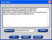
#A text editor displays with the default text. Delete this text and type your own text. | #A text editor displays with the default text. Delete this text and type your own text. | ||
| - | #To insert a merge field, click the arrow in the list at the bottom to display the possible options. Select the merge field and click | + | #To insert a merge field, click the arrow in the list at the bottom to display the possible options. Select the merge field and click Insert. |
| - | #When you are finished, click | + | #When you are finished, click OK and the text displays in the Template Mockup window. |
| + | |||
| + | |||
| + | <hr> | ||
| + | [[FTD Document Center|Back to FTD Document Center]] | ||
Current revision
|
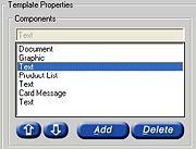
A template can be defined as a series of components, for example graphics, text, etc. The components that make up the template are listed in the Components section. If you are creating a new template, the only component that displays is the Document component. As you add components, they are listed in the same order that they appear in the template, from top to bottom.
Adding Components to Your Template
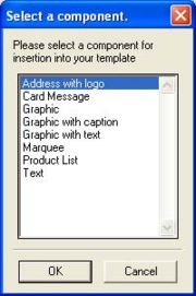
To add a component to the template:
- In FTD Document Center, click Add.
- In the Select a Component window, select the component that you want to add and click OK.
|
When inserting large graphics, you may receive a warning message that the image size exceeds the recommended size; this is normal. |
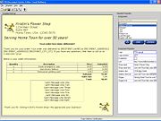
Sample Template with Components
To the right is a sample template to give you an idea of what each of the components can look like in your template (keep in mind that font, alignment, graphics, etc. can be customized).
Changing Component Order
The components display in the same order that they are listed in the Components list box.
To change the order in which a component displays in the Template Mockup window:
- Select the component in the Components list.
- Click the Up or Down arrows to move the selected component up or down in the template.
Template Components
Below are brief descriptions for each of the components. Read through the component descriptions and decide which components you want to insert in your template.
Changing Component Properties
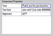
After inserting components into your template, you will then want to change the way they look. You can do this by changing the component properties.
To change component properties:
- In the Components list, select the component that you want to change, and the current properties of that component displays in the Properties grid.
- Each component has a series of properties that can be used to change the content and appearance of the component. For example, if your text already is a 12pt underlined font, and is centered in the template, you can change the alignment for example, double-click on CENTER. You are then taken to a window that allows you to change the alignment and save.
Inserting Merge Fields
You can include personalized customer and order information in the email (such as customer name, recipient information, etc.) by inserting merge fields. Merge fields act as placeholders for specific customer data that you have saved in FTD Mercury. When the email is sent, those placeholders are replaced with actual data.
Merge fields are placed within text. Therefore, first insert a Text component and then customize text.
To insert a Text component and add a merge field:
- With your template on the screen, click Add.
- Highlight Text and then click OK.
- Double-click on the existing text value (Replace with your text!).
- A text editor displays with the default text. Delete this text and type your own text.
- To insert a merge field, click the arrow in the list at the bottom to display the possible options. Select the merge field and click Insert.
- When you are finished, click OK and the text displays in the Template Mockup window.
